The restoration of the font has involved several skilled heritage crafts men and women, its restoration is still under way but here is a sneak peak of its journey so far.
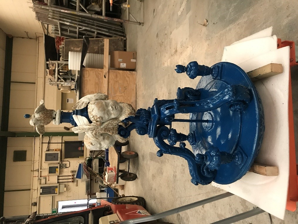
The Historic England listing notice describes Holy Trinity’s font “by Etty and Mansfield of York with fluted marble bowl on turned limestone pedestal sandstone base; suspended cover of carved wood has scroll brackets supporting cherubs and dove finial”. The font is 720mm diameter x 1040 mm tall and the cover currently retracts to 26 inches above font but could rise a further 2 foot.
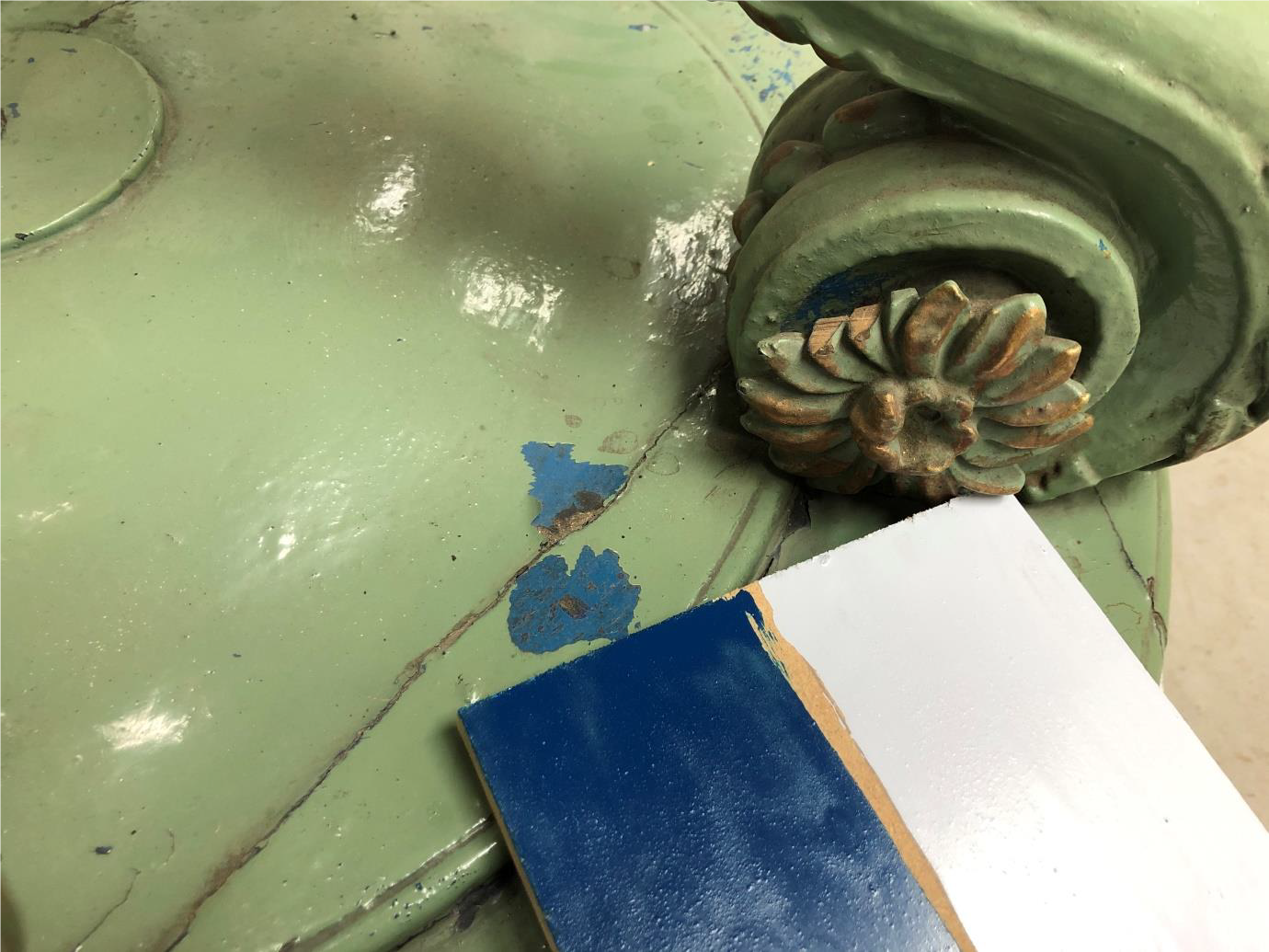
The wooden cover itself is currently painted in pale green and white oil paint with some of the raised detail picked out in bronze-based gold coloured oil paint (not gilding). The cover may be raised by hand via a counterweight (concealed above) and fits into a painted recess in the ceiling. This is an early feature that appears to be coeval with the construction of Holy Trinity in 1719 – a rare and important survivor. The entire weight of the font is carried on a central steel rod fixed to the turned base board with further steel brackets fitted to the three scrolls providing additional structural rigidity.
Rupert McBain carried out an initial assessment for restoration of the font cover and recommended that the font cover was given a light touch treatment to avoid destabilising the structure and ensuring survival of historic finishes.
Stages of treatment:
Surface clean down, disassembly where there are fault joints and repair, very light cutting back of the glossy uneven painted surface with a very fine abrasive paper. Redecoration with oil paints to match the desired historic finish, either original pale blue or predominant deep blue and reinstate areas of gilding as per the current scheme with a 22-carat gold leaf on an ochre tinted oil size.
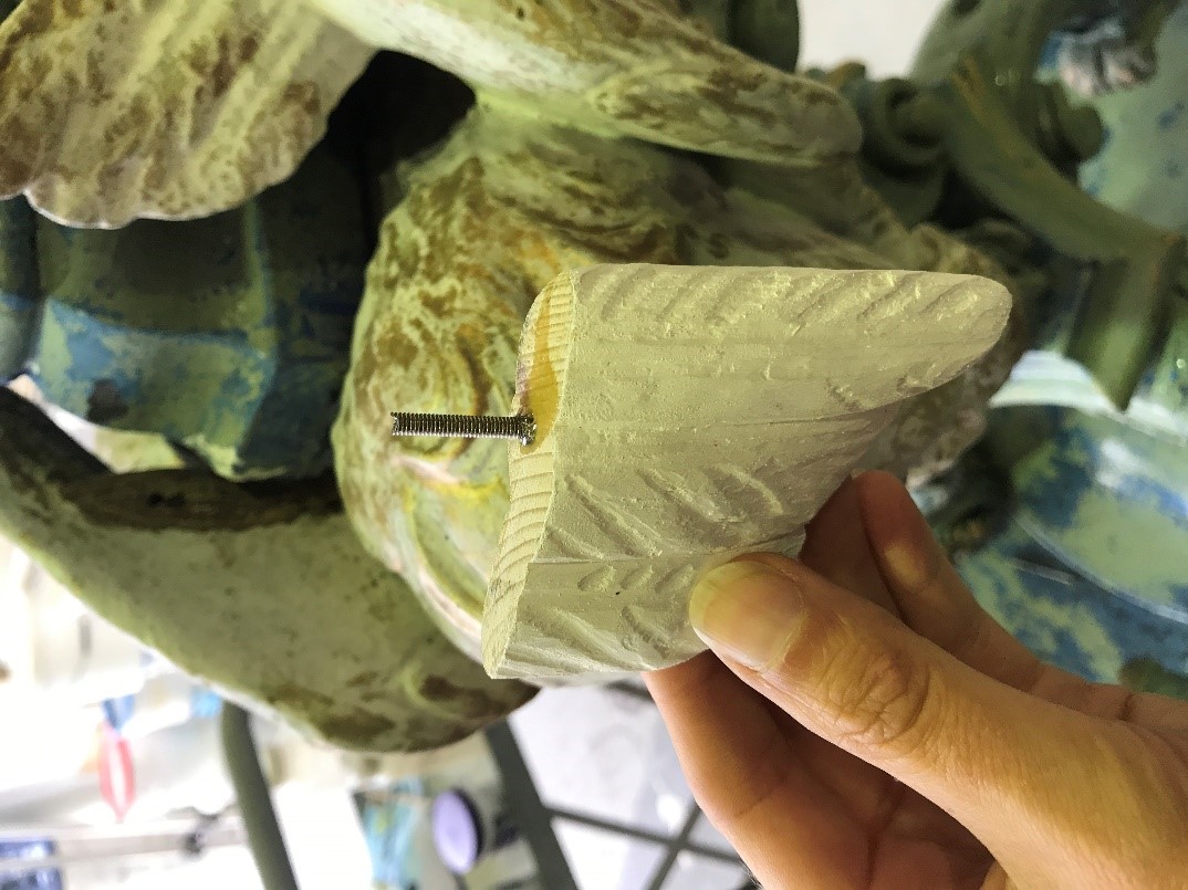
Depending on extent of damage exposed by cleaning back paint, Rupert suggested small missing areas and tips are carefully replaced with matched and carved timber.
Picture highlights Missing tips to scrolls and a missing Bird foot.
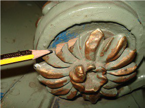
Conservation will entail carefully carving from matching timber.
Crick-Smith undertook phase 2 of a programme of historic paint analysis on the interior spaces at Holy Trinity, they recommended the following approach to conservation, repair and repainting of the font cover is undertaken with a light touch. The surviving paint schemes are all historically significant finishes, and it is not recommended that these are removed. The significant build-up of paint schemes are all non-breathable finishes. This allows for repainting in a finish that is suited to longevity, rather than necessarily adhering to requirements for reversibility.
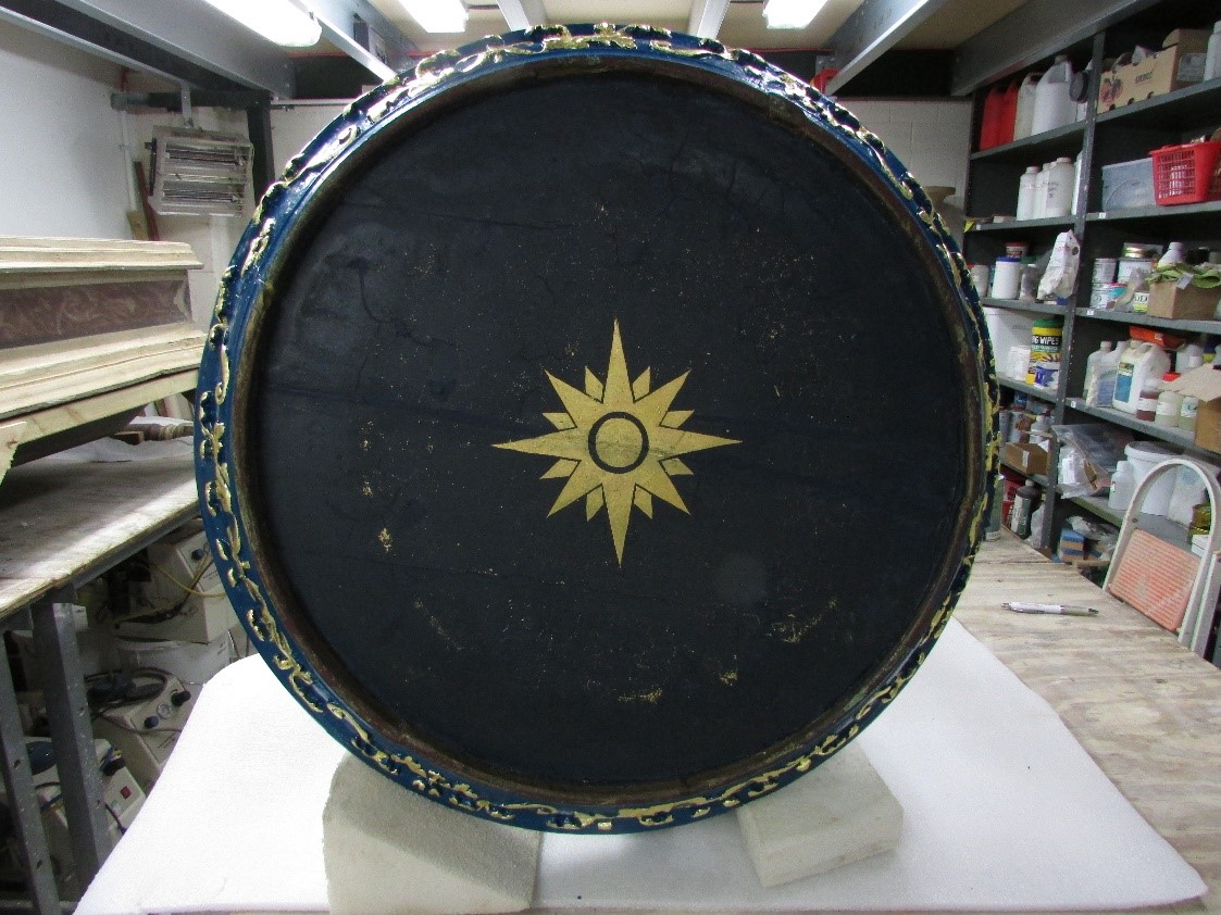
The underside of the font cover is painted deep blue with a small centrally painted star picked out in gold. Several paint samples were removed for analysis to ascertain the original appearance of the piece and to provide an understanding of the chronology of the paints and gilding applied subsequently. To minimize disruption, the number of samples was kept to a minimum (7 in total) and removal of the timber substrate avoided.
All the paints applied to the underside of the font cover were applied in deep blue, with a gilded star applied above the blue to the two most recent schemes only (above a yellow oil size). The faint outline of the previous star (extending to the perimeter of the cover) is just detectable beneath the blue paint.
All the samples on the font cover were removed without a portion of the timber substrate to
avoid digging holes and damaging the surface, hence the lack of evidence for an early wax coating. It is safe to assume the font cover was initially unpainted and simply treated with a wax as a protective coating (potentially beeswax), with clear evidence for this on the underside. There are approximately 13 painted and gilded schemes applied here and it is important to note the scheme numbers used do not correlate with the decorative schemes elsewhere within the church and should be treated in isolation. Although impossible to state exactly when the font cover was first painted, based upon
the nature of the paints used and the number of schemes applied it appears it was first
painted in the late C18 / early C19.
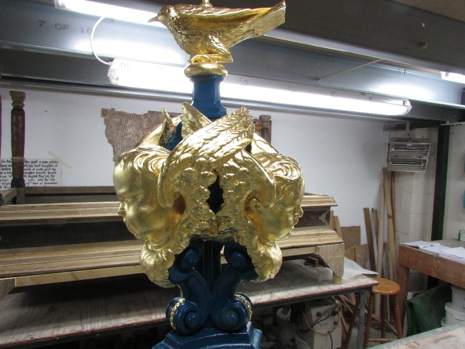
With the exception of the current pale green, the font cover was presented in a consistent theme of blue oil paints (predominantly a deep blue) with gilded highlights (including the cherub’s faces and bird).
As far as restoration is concerned, after replacement of missing timber it is not recommended to strip the cover of all paints/gilding and re-wax. The earlier paint and gilded schemes are historically significant, they are not contributing to decay and are an important part of the narrative associated with this feature. If removed all evidence will be completely lost for future reference and research. It is therefore suggested the surfaces are simply prepared for repainting either in the pale blue of the second scheme, which is the first true oil paint decoration, or in a deep blue, which is the colour used over the longest period. Additionally, the relief decoration, cherubs and bird should be gilded using traditional oil gilding techniques. For the purpose of conservation and redecoration, the font cover and ceiling niche should be considered separately.
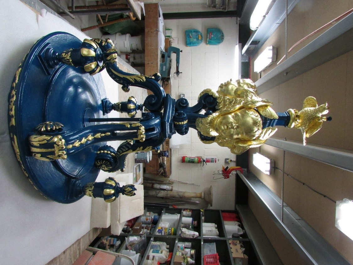
Redecoration and repair were carried out by Skillington Workshop Ltd, by Laura Parker – Conservator, whose role was to carry out repairs to the font cover, replaced missing elements and reinstated an earlier colour scheme of royal blue and gold leaf.
2 samples were prepared for approval by the professional team including a pale blue and a deep blue, after careful consideration we chose the deep blue to match the original colour and agreed to reinstate the gold finish. Laura stated, “It is always fascinating to see the previous colour schemes that have been used over the centuries and to be able to add a new layer to this history.” She also commented that the putti had been painted a green/grey colour which made them look a bit zombie like! They have now been re-gilded and hopefully look a little grander.
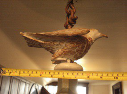
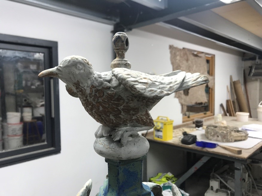
Dove before
Restoring a missing angel wing
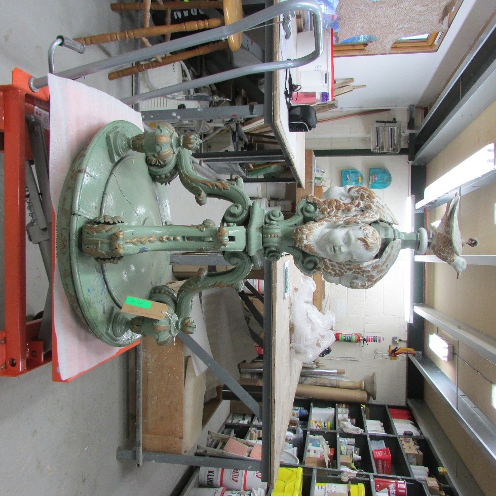
Font cover before
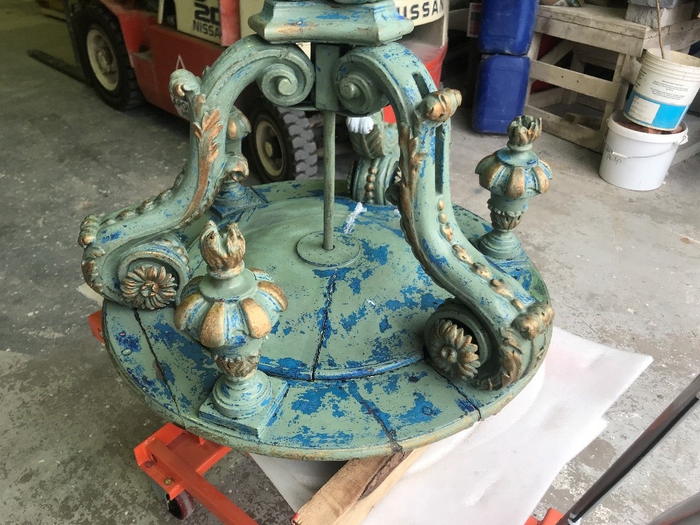
Font cover during restoration
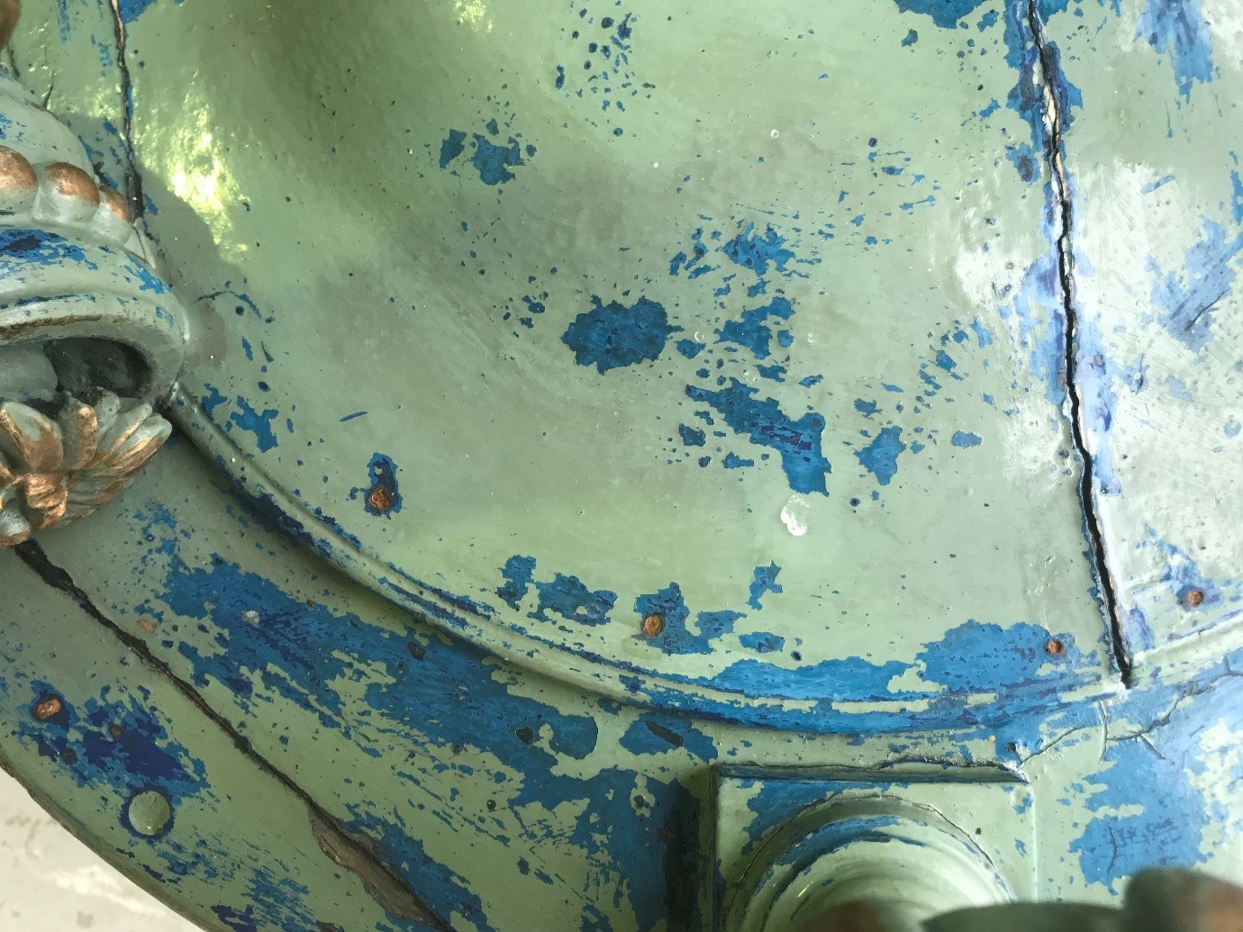
Font cover with old paint scheme show it green and blue
Decoration in progress